What Color Scheme Is Best for Your Office Conference Room?
Since Isaac Newton first placed a prism in a beam of sunlight in the 1660s and published his work Optics, identifying colors by wavelength, scientists have explored how visible light contains the full spectrum of colors, and learned how combining colors can create different ones.
Color Associations
It’s a bit surprising that despite Newton’s discoveries, much of what we believe about how color affects emotions or mood is still anecdotal. A 2020 study identified common emotional associations people from 30 different countries have with color.
Although cultural differences can create divergence in these associations (for example, some cultures wear black for mourning, while others wear white), generally, study subjects linked red with love, black with sadness, yellow and orange with joy, blue with relief, green with feelings of contentment, and brown with disgust.
So we do know that color has an emotional impact, and the colors you choose for certain areas in your office may influence mood and concentration, and therefore, productivity. Consider the psychology of color and what color scheme is best for your office conference room.
Color Symbolism and “Temperature”
Poets and artists have used color symbolically for centuries. Red denotes passion, white symbolizes purity, green stands for nature, and so on.
The color spectrum is described in terms of temperature, with those in wavelengths on the red side of the spectrum called “warm” and those on the blue side described as “cool.”
How Color Influences Productivity
There are thousands of color families in the color wheel, and all of them have different effects on how a person feels and works. Red tends to promote action, but red cars are also more likely to be pulled over or involved in accidents. Ball players dressed in black tend to receive more penalties. And people tend to associate white pills with greater pain relief.
But what does all this mean for what color scheme is best for your office conference room? Two clues can help: some colors are immediately identifiable as being associated with particular brands, and, while general universal reactions to color exist, most color preferences are highly individual and change over time. That’s why there’s a different “color of the year” every year.
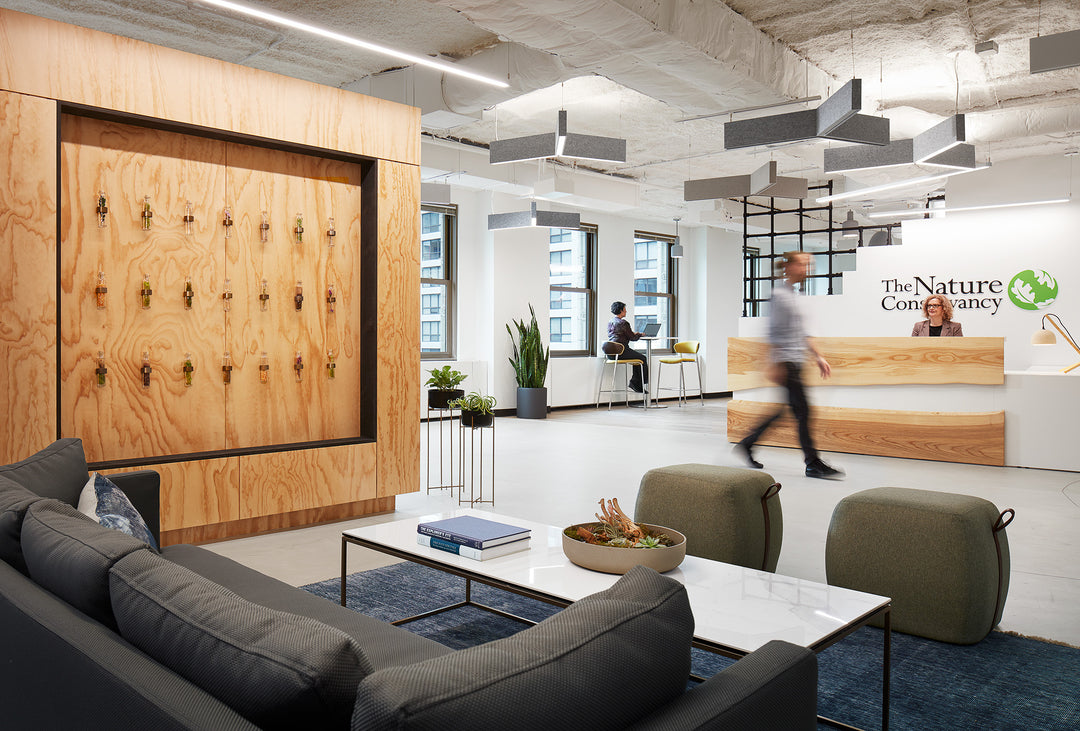
This suggests that injecting a little variety into your office color scheme can be effective. Rather than presenting your team with solid walls of uninterrupted color, you can add texture using fabric color panels of different hues and tones, or complementary colors. Fabric panels not only provide color variation, but also improve acoustics, dampening distracting sound.
You could also use one accent wall to reflect your company’s branding, while the other walls can present a neutral hue that minimizes distraction. Add multicolored artwork to walls in windowless spaces to provide a break for the eyes.
It’s important to us at Rework that our clients have the resources they need to promote a positive and productive workspace for their team. Whether you need conference table chairs or a change in your conference room’s layout, our team of experienced planning and design experts will work with you to determine the arrangement that fits your needs and help you pick a paint palette that’s perfect for getting your team engaged.


